
You spend hours editing the perfect hook, only to have your Shop Now text covered by the user’s profile picture.
In 2026, the TikTok interface is more crowded than ever. Between the Search bar at the top, the Like/Comment/Share stack on the right, and the new Product Anchor Links at the bottom, your available canvas is significantly smaller than the full screen.
Get Up to $6000 Free TikTok Ad Credit
Ignoring TikTok Ad Safe Zones is the most expensive mistake a creative team can make. If your key value proposition or CTA is obstructed by a UI element, your Click-Through Rate (CTR) can drop by up to 40%. Users won’t squint to read your text; they will just scroll.
This guide is your grid system for 2026. We will break down the exact pixel dimensions of the Dead Zones, the specific constraints for Video Shopping Ads, and how to use preview tools to guarantee 100% visibility before you spend a dollar.
Table of Contents
Key Takeaways
- The UI Squeeze: In 2026, TikTok added more interactive elements (Search Bar, Shop Tab). The Safe Zone has shrunk compared to 2023.
- Vertical Supremacy: Only use 9:16 (1080×1920) videos. Square or Landscape videos waste screen real estate and often get cropped awkwardly by the algorithm.
- The Product Card Blind Spot: If you run Shop Ads, the interactive product tile pops up over your video. If your captions are at the bottom, they will be invisible.
- Center-Middle Rule: The safest place for your Hook text is the visual center of the screen. The eye naturally rests here, and it is the only area guaranteed to be clear on all devices.
- Previewing is Mandatory: Never trust your video editor’s preview. You must simulate the TikTok UI overlay to see what the user sees.
Phase 1: The Dead Zones (Exact Pixel Specs)
Stop guessing. Here are the exact coordinates you must avoid on a standard 1080 x 1920 pixel canvas.
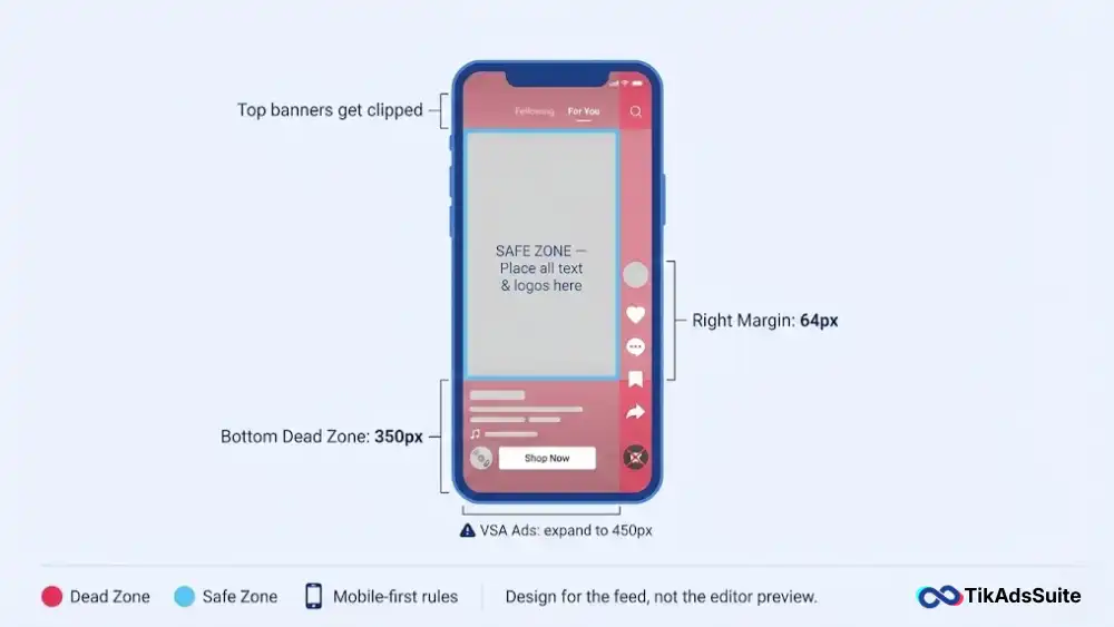
1. The Bottom Zone (The Danger Area)
This area is the most crowded. It contains the Caption, User Handle, Audio Disc, and the Shop Now button.
Rule: Keep the bottom 350 pixels clear of any essential text or logos.
Exception: For Video Shopping Ads (VSA), increase this to 450 pixels to account for the pop-up Product Card.
2. The Right Zone (The Engagement Stack)
The right side is home to the Like, Comment, Save, and Share buttons.
Rule: Keep a 64-pixel margin from the right edge.
Tip: Do not put your logo in the bottom-right corner. It will be covered by the spinning record disc.
3. The Top Zone (The Navigation Bar)
The top includes the Following/For You tabs and the Search icon.
Rule: Keep the top 130 pixels clear.
Mistake: Placing a Breaking News banner at the very top often gets cut off by the phone’s status bar (battery/time) or the TikTok search field.
Phase 2: Format-Specific Constraints
Not all ads are created equal. The UI changes depending on your campaign objective.
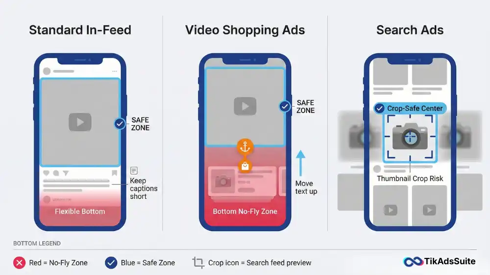
1. Standard In-Feed Ads
Context: The standard view.
Safe Zone: Moderate. You have more room at the bottom than Shop ads, but the caption length (up to 4 lines) can expand upwards.
Strategy: Keep captions short (1 line) to maximize your visual real estate.
2. Video Shopping Ads (VSA)
Context: eCommerce ads linked to TikTok Shop.
The Anchor Problem: These ads feature an interactive Product Anchor Link (orange icon) or a Product Card that slides up.
Safe Zone: Severe constraints. The bottom 25-30% of the screen is essentially a No Fly Zone.
Fix: Move all subtitles and speech bubble text to the upper-middle quadrant.
3. Search Ads
Context: Ads appearing in the search results feed.
Safe Zone: These are often displayed in a dual-column Pinterest-style feed before the user clicks.
Strategy: Ensure your main visual (the product) is centered so it looks good even when cropped into a smaller thumbnail in the search feed.
Phase 3: The Center-Middle Design Philosophy
Since you cannot predict exactly how the UI will render on every device (iPhone Pro Max vs. older Androids), the only failsafe strategy is Center-Middle.
The Golden Rectangle
Imagine a box in the center of your screen:
Width: 900 px
Height: 1200 px
Position: Centered.
Everything that matters, your hook text, your product demo, your face, must live inside this box. The rest of the screen (the edges) is just ambiance.
Vertical vs. Horizontal Logic
Vertical (9:16): The standard. Fills the screen.
Horizontal (16:9): Do not use. TikTok adds massive black bars to the top and bottom. This wastes 60% of the screen and makes your brand look outdated.
Phase 4: Common Safe Zone Failures
Avoiding these mistakes will put you ahead of 80% of advertisers.
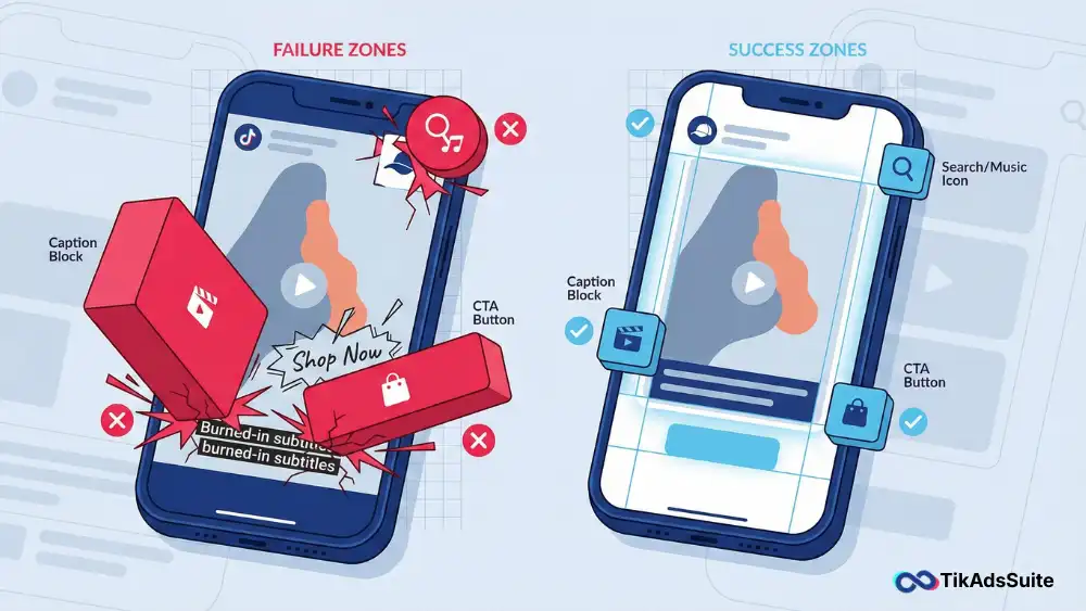
1. The Burned-In Caption Fail
You edit your video in CapCut and place captions at the bottom. You upload to TikTok Ads Manager.
The Result: The TikTok native caption (white text) overlays on top of your burned-in captions. It becomes an unreadable mess.
The Fix: Place burned-in captions in the middle of the screen, or use TikTok’s native auto-captions, which adjust automatically.
2. The Fake Button Trick
Some advertisers draw a fake Shop Now button on the video to get clicks.
The Problem: If you place it too low, the real button covers it. If you place it too high, it looks fake.
The Policy: TikTok often rejects ads with fake interface elements (Non-functional buttons). Stick to using the native CTA button provided by the ad platform.
3. Logo Placement Errors
Brands love putting their watermark in the top-right corner.
The Conflict: This is exactly where the Music or Search icon sits. Your logo will be obstructed.
The Fix: Move branding to the top-left or integrate it into the scene (e.g., on the product itself or the shirt of the actor).
Tool Tip: Are your text overlays legible? Run your creative through the TikTok Ad Creative Analyzer. It can score the Text-to-Background contrast and warn you if your text density is too high or poorly placed.
FAQ: TikTok Ad Safe Zones
What are TikTok ad safe zones?
TikTok ad safe zones are the areas of a video where text, logos, and key visuals won’t be covered by TikTok’s interface. The app places captions, buttons, the profile icon, and CTA elements over the edges of every ad. Keeping important content inside the safe zone keeps it visible and readable.
What are the exact TikTok safe zone dimensions?
On a 1080 x 1920 pixel canvas, keep the top 130 pixels and the right 64 pixels clear. Leave the bottom 350 pixels clear for standard ads, or 450 pixels for Video Shopping Ads. Put your most important text and visuals in a centered area of about 900 x 1200 pixels.
Do TikTok safe zones change for iPhone vs Android?
Slightly, because some phones have taller screens than others. A centered safe zone still covers the vast majority of mobile devices. Keep key elements inside it, and your ad will display correctly on both iPhone and Android.
Can I rely on Clear Mode to show my full video?
No. Viewers can turn on Clear Mode to hide the interface, but most people scroll with captions and buttons visible. Design your ad for the normal view with all interface elements showing.
What happens if I upload a video that isn’t 9:16?
If you upload a square 1:1 or horizontal video, TikTok centers it and adds black bars, which is called letterboxing. Your content won’t be cut off, but it looks less native and usually gets lower engagement. Always crop to 9:16 before you upload.
How do I fix a video that already has text in the dead zone?
You have two options. The best fix is to reopen the source project and move the text into the safe zone. If you no longer have the project file, scale the video down to about 90% so the text moves inward, and fill the background with a blurred copy of the video.
Conclusion: Respect the Interface
In 2026, the TikTok Ad Safe Zone is not a suggestion; it is a constraint. You are renting space in TikTok’s house, and you have to respect their furniture.
If you design your ad with the UI in mind, leaving the bottom clear and centering your hook, you ensure that every impression you pay for actually delivers your message.
Your Action Plan:
- Download a Safe Zone Overlay (transparent PNG) from Google Images and add it to your video editing software as a guide layer.
- Ensure your video editor is set to 1080×1920 (9:16).
- Before exporting, toggle the overlay on to check for obstructions.
- Final check: Use the TikTok Ad Creative Audit Tool to double-check your file specs.
Design for the Squeeze, and you will win the click.