
If you are asking users to leave TikTok to view your products, you are losing 40% of them at the door.
In the friction-filled world of mobile commerce, every second of load time is a bounce risk. TikTok users do not want to wait for your Shopify store to load. They want to browse, swipe, and shop immediately.
Enter TikTok Collection Ads. In 2026, this format has evolved into the ultimate Window Shopping experience within the Video Shopping Ads (VSA) ecosystem.
Get Up to $6000 Free TikTok Ad Credit
It combines the engagement of a viral video with the utility of a catalog, allowing users to tap a card and instantly enter a fast-loading Instant Gallery Page to browse your bestsellers without ever leaving the app.
However, simply syncing your catalog isn’t enough. If your product images are boring or your gallery is disorganized, you will pay for clicks that never convert.
You need a visual merchandising strategy that moves the eye from the video to the card, and from the card to the checkout.
This guide is your visual merchandising playbook. We will cover how to design Product Tiles that get tapped, how to structure your Instant Gallery for maximum Average Order Value (AOV), and the visual psychology behind the perfect Collection Ad.
Table of Contents
Key Takeaways
- The Hero + Halo Strategy: Your video should sell one specific problem/solution (The Hero), while your bottom gallery cards show the accessories (The Halo).
- Speed Wins: The Instant Gallery page loads 11x faster than a mobile website. Use this to your advantage by keeping the design clean and image-focused.
- Visual Consistency: Your video aesthetic must match your product card aesthetic. If the video is Lo-Fi UGC and the product cards are Sterile White Background, the disconnect kills trust.
- Curated Sets > Full Catalog: Do not dump your entire inventory into a Collection Ad. Create specific sets like Summer Essentials or Best Sellers to reduce decision paralysis.
- The visual Anchor: You must visually cue the user to look down. Using a physical gesture (pointing) in the video increases card taps by up to 25%.
Part 1: The Evolution of Collection Ads in 2026
Before we dive into the visuals, we need to clarify the format. In 2026, TikTok has streamlined its commerce solutions.
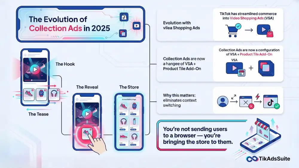
While we still refer to them as TikTok Collection Ads, they are technically deployed as a specific configuration of Video Shopping Ads (VSA) using the Product Tile interactive add-on.
The User Experience:
- The Hook: A user sees a video in their feed demonstrating a product.
- The Tease: A row of small product thumbnails (Display Cards) appears at the bottom of the video.
- The Reveal: The user taps a card or the Shop Now button.
- The Store: An Instant Gallery Page slides up (Full Screen), allowing them to browse a curated list of items and add to cart instantly.
This format solves the biggest problem in social commerce: Context Switching. You aren’t forcing the user to open a web browser; you are bringing the store to them.
Part 2: Visual Selling Tips for the Hero Video
The video is the bait; the gallery is the hook. Your video needs to visually justify why they should tap to see more.
A generic brand video won’t work here. You need a specific visual relationship between the video content and the product cards below.
1. The Visual Anchor Technique
Your video must visually reference the products in the cards below immediately.
- The Mistake: A generic lifestyle video showing a beach, while the product cards show sunglasses.
- The Fix: The model in the video is wearing specific Green Sunglasses. The first product card below is those exact Green Sunglasses.
- Why: This creates a visual anchor. The eye moves from the video to the matching thumbnail naturally. If the visual doesn’t match the card, the brain perceives a disconnect and scrolls past.
2. Point to the Shelf
You cannot rely on the user noticing the cards. You must direct their eyes. Use a Physical Cue in your video creative.
- The Tactic: At the 3-second mark, have the creator point down and say, Check the cards below to see the other colors.
- The Effect: This trains the user to look at the interactive element. Data shows that explicit visual cues can increase your Click-Through Rate (CTR) significantly.
3. Match the Aesthetic (The Vibe Check)
One of the most jarring experiences for a user is watching a dark, moody, edgy video, clicking a card, and landing on a bright, sterile, white-background gallery.
- Visual Strategy: Use Lifestyle Images in your catalog feed if possible. If you sell streetwear, your product cards should show the clothes on a person, matching the vibe of the video.
- Consistency: The lighting, color grading, and energy of the video must flow seamlessly into the Instant Gallery.
Tool Tip: Are your video visuals hitting the mark? Use the TikTok Ad Creative Analyzer to score your video assets against top-performing ads in your niche before you launch.
Part 3: Optimizing the Instant Gallery (The Storefront)
Once they click, they enter your mini-store. This page needs to be merchandised just like a physical retail shelf. You have limited space, so every pixel counts.
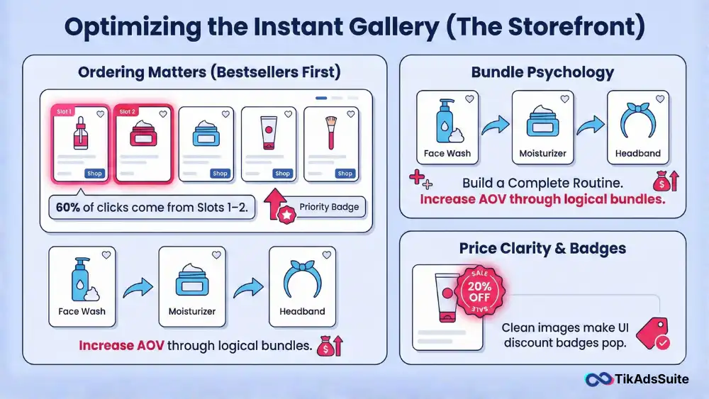
1. Ordering Matters (Bestsellers First)
You can manually curate the order of products in your Instant Gallery. Do not leave this to chance.
- The Rule: Slots 1 and 2 get 60% of the clicks.
- The Strategy: Put your highest-converting, lowest-friction items here. Do not bury your lead product in slot 5. If your video features a specific item, that item must be in Slot 1.
2. The Bundle Psychology
Use TikTok Collection Ads to increase Average Order Value (AOV). Do not just list random items. Build a logic chain.
- Scenario: You are selling a face wash.
- Video: Shows the face wash removing makeup.
- Gallery: Slot 1 is the Face Wash. Slot 2 is a Moisturizer. Slot 3 is a Headband.
- Result: The user came for the wash but sees the Complete Routine and adds all three.
3. Price Clarity & Badges
Ensure your catalog feed sends the correct Sale Price vs. Compare at Price.
Visual Tip: TikTok will display a Sale badge if you send both price points. This visual red flag triggers impulse buys. If your images are cluttered with text, these badges gets lost. Keep your product images clean so the TikTok UI badges pop.
Tool Tip: Is your bundle offer strong enough? Run your pricing strategy through the TikTok Ad Offer Analyzer to see if your discount structure is competitive enough to drive higher AOV.
Part 4: Technical Specs & Safe Zones
Visual selling fails if the tech is broken. If your text is covered by a button, you look unprofessional. Follow these specs strictly for 2026.
Video Requirements
- Ratio: 9:16 (Vertical). Never use square videos; they look cheap in VSA and waste screen real estate.
- Resolution: 1080 x 1920 pixels.
- Length: 15-30 seconds is the sweet spot for commerce.
Product Card Requirements
- Image Ratio: 1:1 (Square) works best for the tiles.
- Resolution: Minimum 600 x 600 pixels.
- Title Length: Keep titles under 20 characters if possible. Men’s Black Tee is better than Premium Cotton Men’s T-Shirt Black Size L which gets truncated.
The Dead Zone
The bottom 250px of your video is the Dead Zone. This is where the Product Tiles sit.
- The Rule: Do not put captions, subtitles, or key visual elements in the bottom 25% of the screen. They will be covered by the product cards, making your ad look broken.
Part 5: Troubleshooting Low Performance
If your TikTok Collection Ads aren’t performing, diagnose the visual funnel using this checklist.
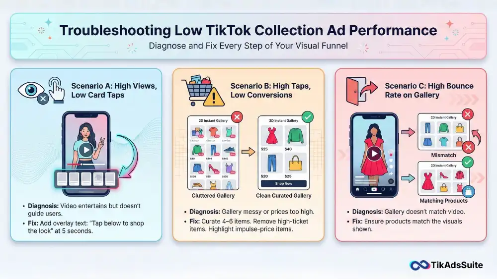
Scenario A: High Video Views, Low Card Taps
- Diagnosis: Your video is entertaining, but you forgot to sell the Browse action.
- Fix: Add a text overlay at 5 seconds: Tap below to shop the look. You need to explicitly tell them the cards are clickable.
Scenario B: High Taps, Low Conversions
- Diagnosis: Your Instant Gallery is messy, or prices are too high.
- Fix: Curate the gallery down to 4-6 highly relevant items. Remove the $500 items that scare people away. Focus on impulse-price items ($20-$50).
Scenario C: High Bounce Rate on Gallery
- Diagnosis: The gallery doesn’t match the promise.
- Fix: Ensure the products in the gallery are actually the ones shown in the video. If you show a red dress but link to a gallery of blue jeans, users leave immediately.
Tool Tip: Is your destination page optimizing for conversions? Use the TikTok Landing Page Analyzer to check if your Instant Gallery setup aligns with best practices for speed and clarity.
More helpful articles you’ll want to explore:
👉 TikTok Ads Credit: Get Free $6000 Cash Back Promo
👉 Top 10 TikTok Ads Metrics For PPC Specialists
👉 TikTok Symphony AI Creative Suite Explained: Guide to Smarter, Faster Ad Creation
👉 TikTok Lead Gen Ads: Complete Setup and Optimization Guide
FAQ: TikTok Collection Ads
Do I need a TikTok Shop to run Collection Ads?
Not necessarily. You can run Video Shopping Ads (the new name for Collection) pointing to an external Shopify URL. However, the experience is smoother if you link to a TikTok Shop Instant Page because it loads instantly within the app infrastructure.
Can I use dynamic images for the cards?
Yes. If you connect your Catalog, TikTok can Dynamically choose which products to show in the tiles based on what that specific user is most likely to buy. We recommend Dynamic for broad targeting and Manual Selection for specific product launches where you want to control the narrative.
How many products should I have in a collection?
A Collection Ad needs at least 4 products to run. However, we recommend a set of 6 to 8 items. Too few feels empty and doesn’t encourage browsing; too many causes scroll fatigue where the user can’t decide what to pick.
Do Collection Ads work for services?
Generally, no. This format is designed for physical SKU-based products. The visual nature of the cards requires tangible items (shoes, lipstick, gadgets). If you sell services, use Lead Generation forms instead.
Conclusion: Curate, Don’t Clutter
In 2026, the TikTok Collection Ad is your most powerful visual merchandising tool. It allows you to tell a story with video and close the sale with a catalog, all in one view.
But remember: Curation is King. Do not just sync your whole feed and hope for the best. Build specific Outfits, Routines, or Bundles that make sense together. Treat your Instant Gallery like a boutique window display, not a warehouse shelf.
Your Action Plan:
- Select your Hero product and 3 Accessory products.
- Film a video demonstrating the Hero with a clear point down CTA.
- Upload your assets and ensure no text is in the bottom 25% Dead Zone.
- Launch a Product Sales campaign with the Product Tile add-on today.